TackYard is the vision of a group of horsey entrepreneurs who got really frustrated with searching local yard sales, eBay and Facebook and created something much easier – a dedicated marketplace for quality used horse stuff!
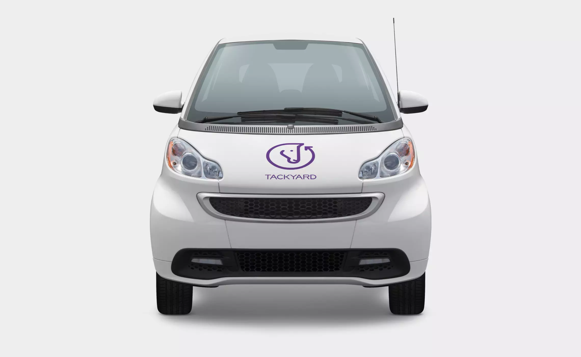
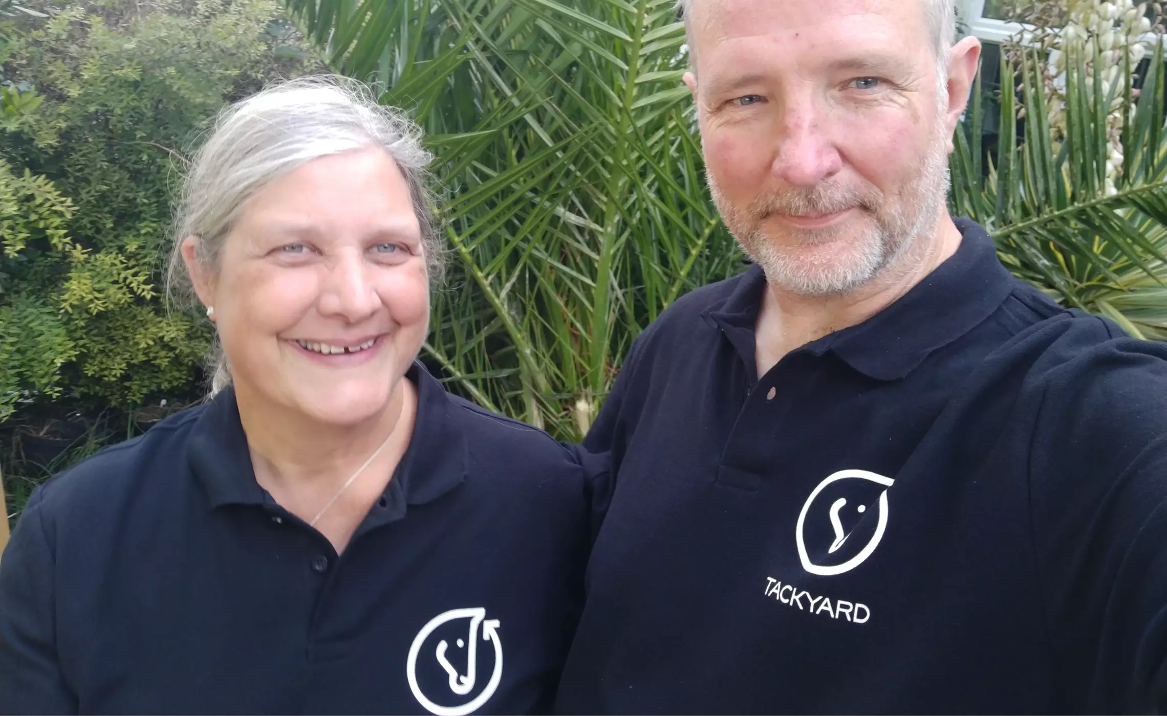
Starting with a simple idea and a strong vision, they asked us to help with the creative side of things. We produced the branding, including the simple and meaningful brand identity and all subsequent applications. The circular arrow motif with the detail of the subtle heart arrowhead combined with the distinctive profile of a horse’s head communicates the unique offering, clearly and beautifully. It works well at small sizes, online and on social channels and stands out on branded items, t-shirts and stationery.
Honk if you’re horsey, and if you have a quality used saddle burning a hole in your stable, canter over and give them a gallop…
Skills & tools
- Brand Identity Design
- Brand Language
- Brand Application
You captured the essence of our (new) business perfectly. Your creativity and communication were outstanding, and the results speak for themselves. We couldn't be more pleased – thank you so much!
Rebecca Luff
Founder, TackYard
Related projects
Tidy Shampoo
Naming, brand identity design, branding system, packaging design and advertising for Tidy handmade shampoo bars for men.
Phillippa Winton
Brand identity, design language, labels and packaging design for entrepreneurial crafter and maker Phillippa Winton.


