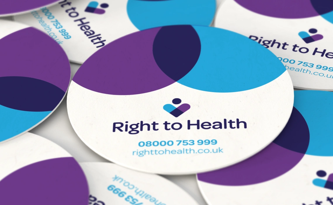
Working with long term collaborator Run Digital, we completed a full rebrand for one of the UK’s largest and most trusted online health insurance brokers, Right To Health.
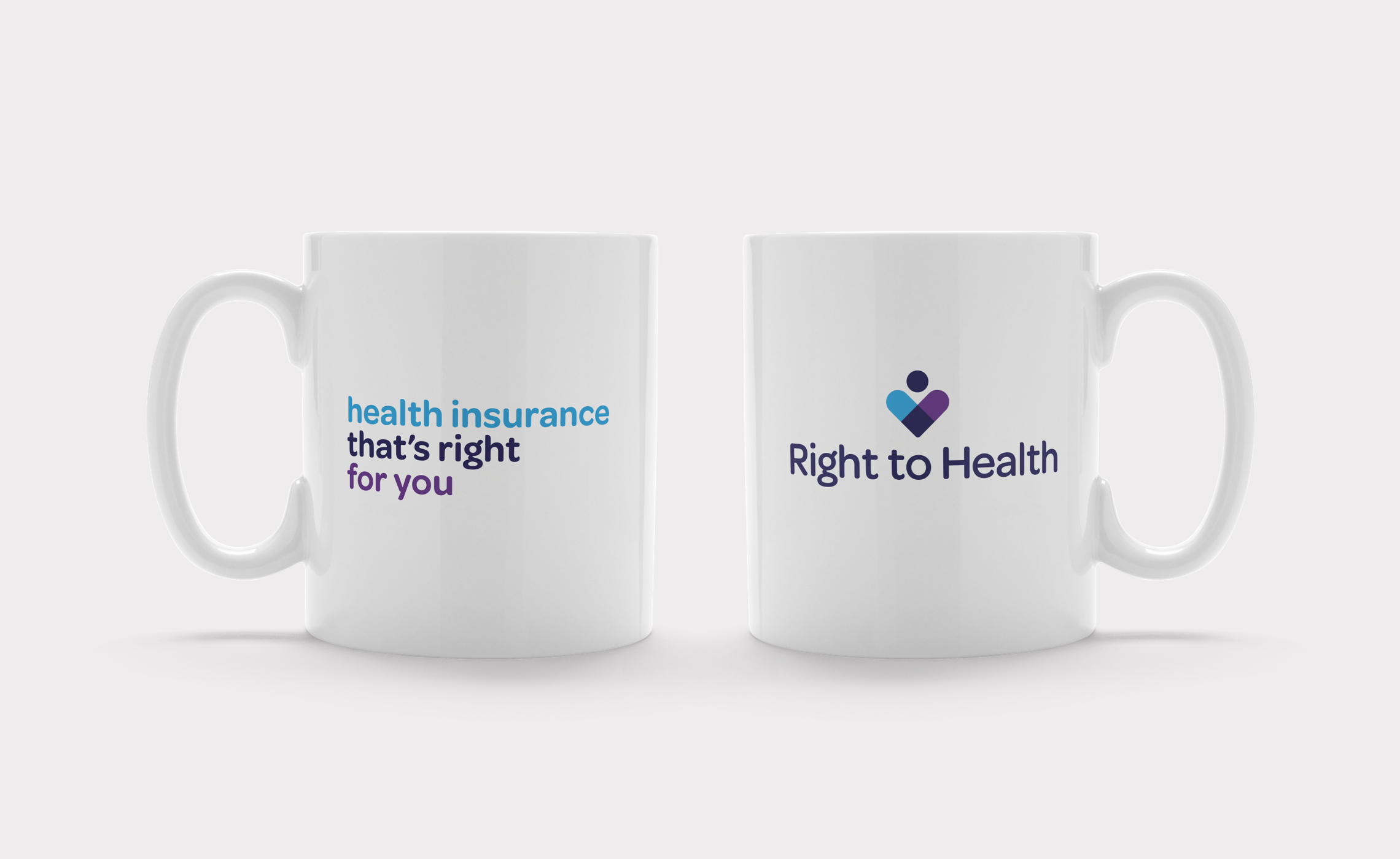
They were looking for standout in a crowded marketplace of course but they also wanted to emphasise the very personal nature of their approach and highly rated service – it really is all about the people! We created a distinctive new brand identity that played with the symbology of this and used a multi-colour typography and a fresh graphic language for use online and offline on all print collateral and merchandise.
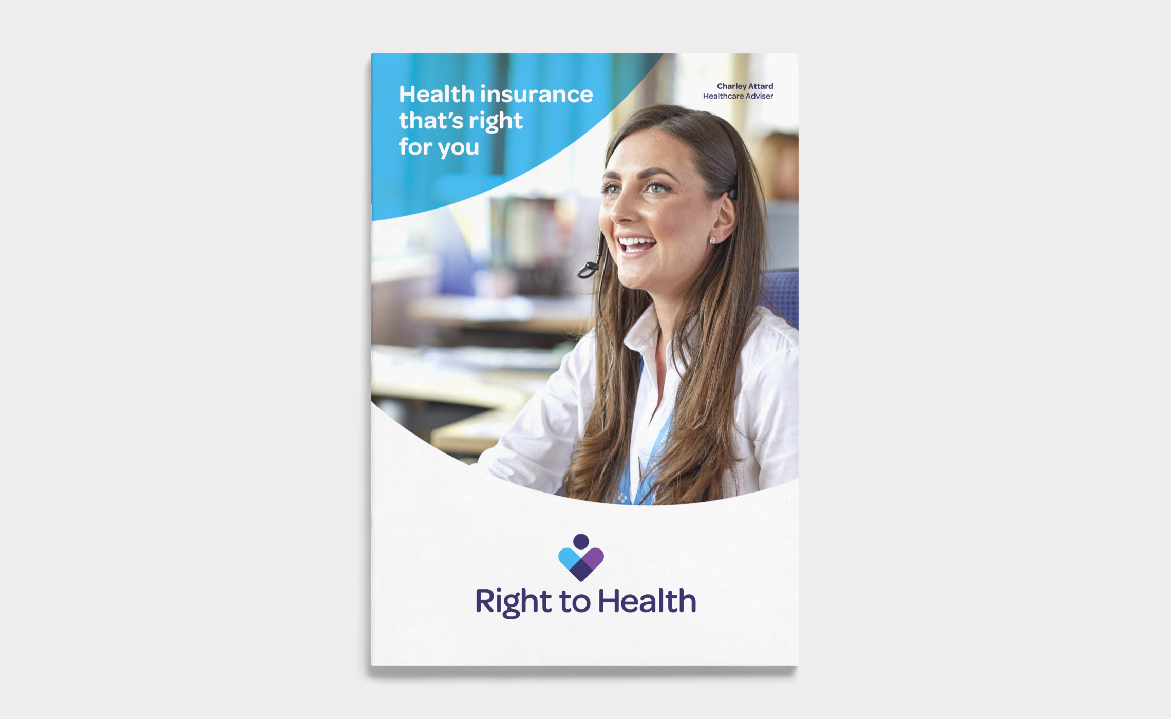
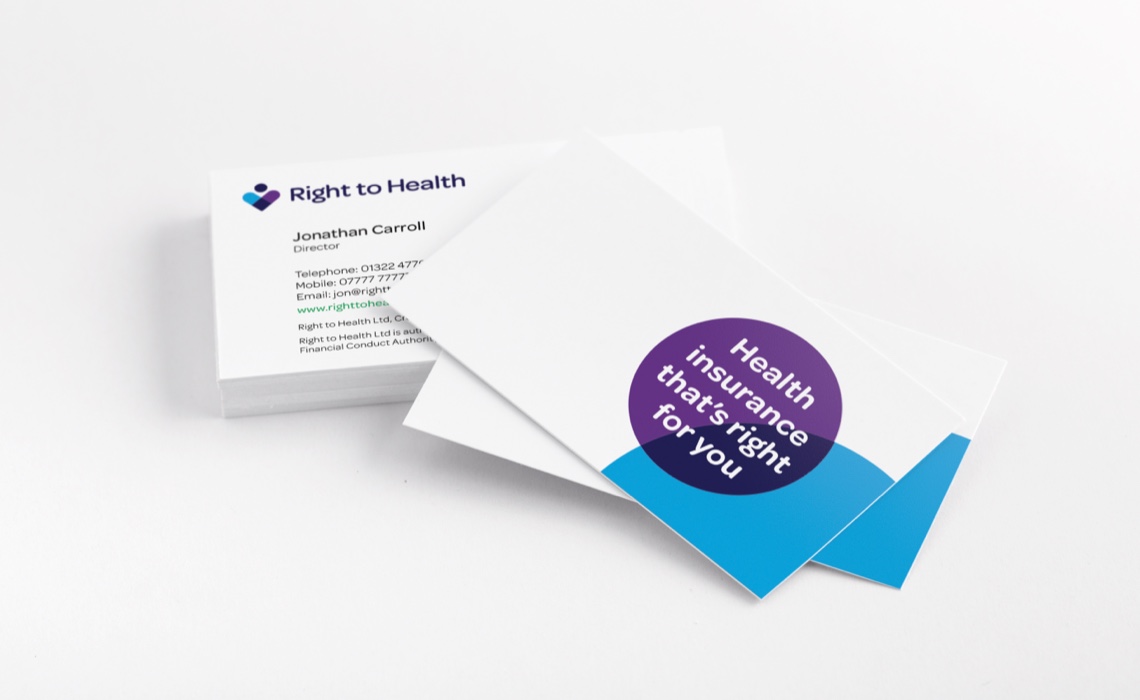
We have also since designed the full suite of print brochures and leaflets for the business, as well as all corporate stationery and other print material and were also asked to design their new office interior after a major refit – posters, window graphics and signage.
Visit: righttohealth.co.uk
Brand Language
People remain front and centre of the Right to Health brand – from their friendly call centre staff photography and posters, to the simple iconography of their new brandmark.
We created a flexible mark representing two people; the adviser and client together. The resulting symbol has multiple variants and colour-ways, and works well online and offline, even at small sizes.

Skills & tools
- Brand Identity Design
- Brand Application
- Graphic Design
- Merchandise Design
- Signage Design
Related Projects
Tellworth Investments
Brand identity and website design for specialist equity investment management boutique, Tellworth Investments' new British Recovery and Growth Trust.
Cripps Pemberton Greenish
Large rebrand, brand language, web design, advertising and internal communications campaigns for this leading UK law firm.
We needed an interface design that was easy for all users to navigate. The designs you provided have not changed since launch and the system’s ease of use is always the first thing that draws client commendations.


