


ParcelVision is the SaaS division of one of the UK’s leading online logistics businesses, founded over 20 years ago.
With unparalleled technical expertise, a team of 60 and more than 7 million parcels shipped, they are now bringing their innovative software to major online retailers in the UK, Europe and America. Their proven technology allows customers to track shipments and self-serve whilst offering retailers one platform to manage all shipments with every carrier – lower costs, less friction and better customer service.
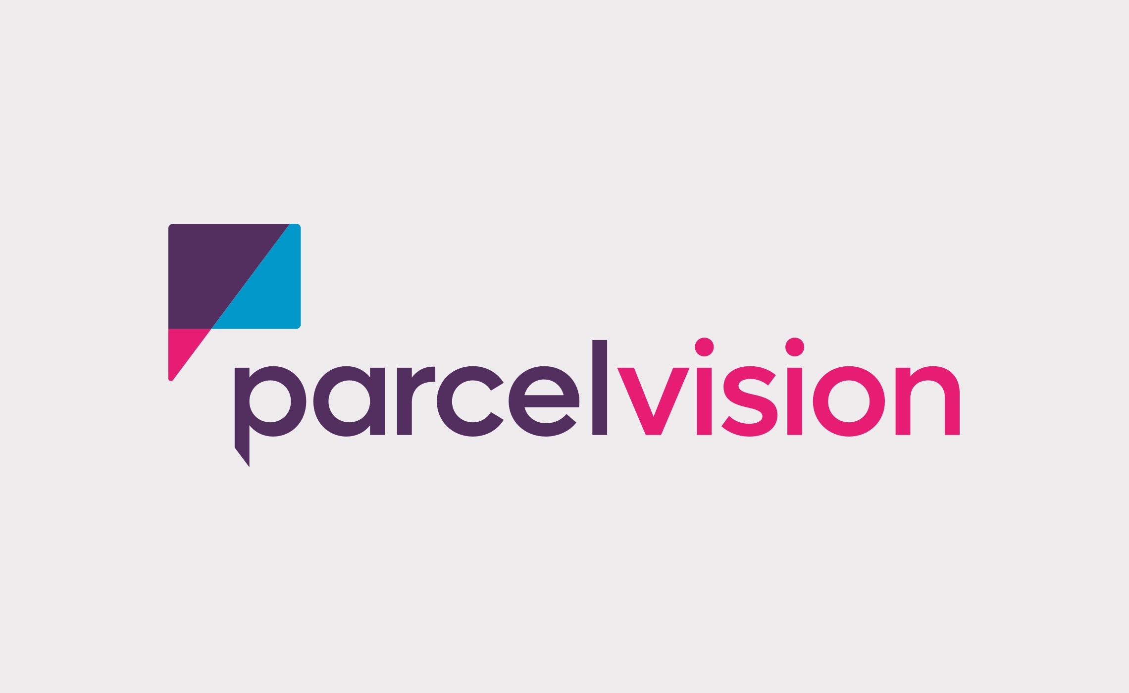
To make a big impact on the global stage, they realised their branding had to stand out and work hard and asked us to create it for them. The overlapping lines and shapes of the finished brandmark, inspired by movement and conversations, form an abstract speech bubble as well as a recognisable ‘P’ shape. The correspondent wordmark uses a geometric, round sans serif typeface with customised angles and details, and the colour palette is vibrant and clear.
Skills & tools
- Brand Identity Design
- Brand Language
- Brand Application
A simple, recognisable brandmark that communicates (quite literally in this case) goes a long way. ParcelVision is all about saving you time (and money) whilst handling your customer’s online delivery experience and queries seamlessly.
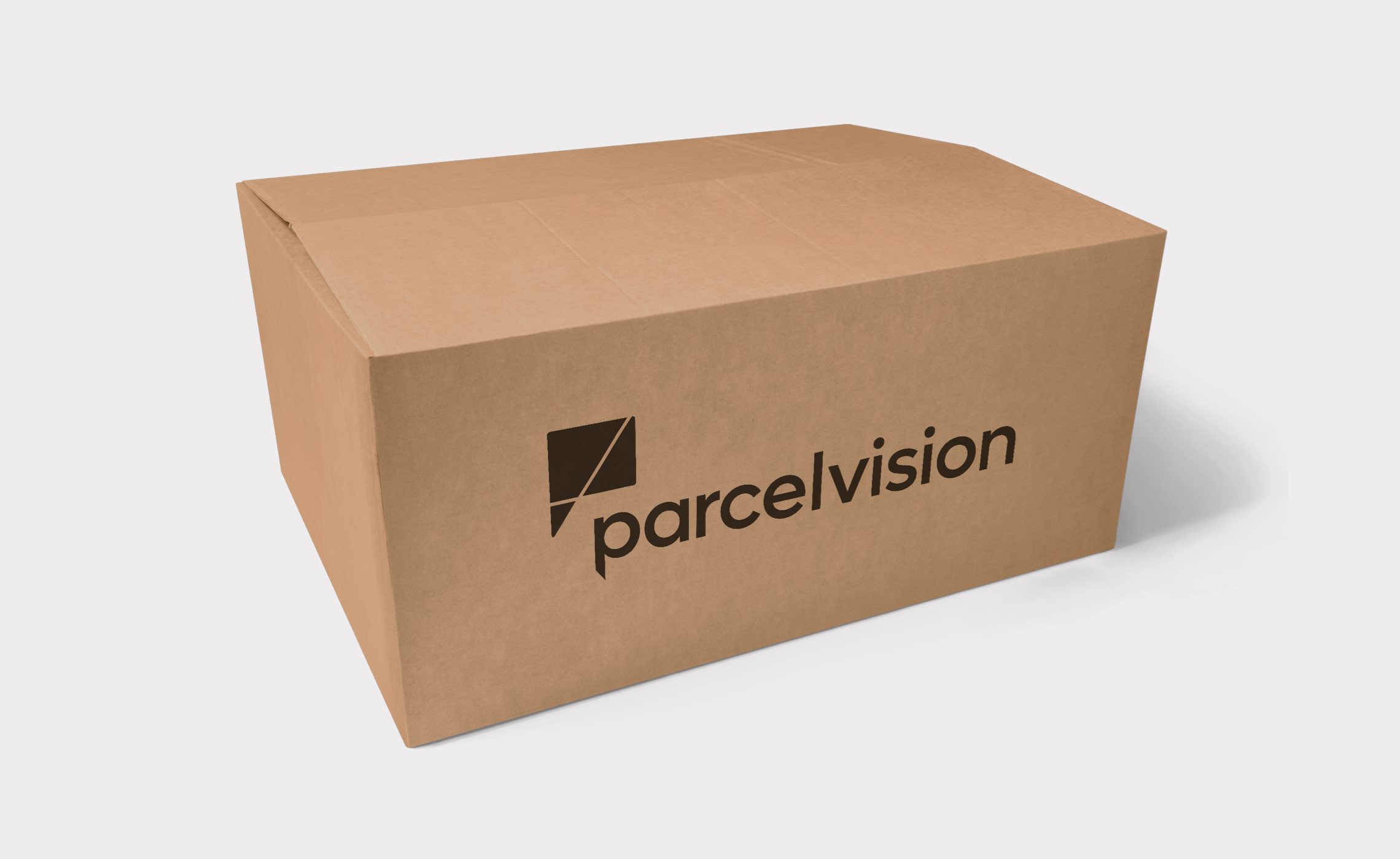
The branding has to remain legible in all applications and in the smallest of spaces. From avatars and icons through checkout and login screens, it needs to remain both recognisable and seem familiar alongside other (larger) brands to help build trust in the marketplace.
The bold, bright colour palette and flexible styles build into a wider graphic language for the brand’s new website and offline sales material.
I knew we'd chosen the right design agency!
Charles Astwood
CTO, ParcelVision
Related projects

Accession Capital Partners
Brand identity design, brand architecture, application and website for European fund management group Accession Capital Partners.
BambuBlack
A full rebrand and brand positioning for this specialist Asia-Pacific fund and asset management boutique.