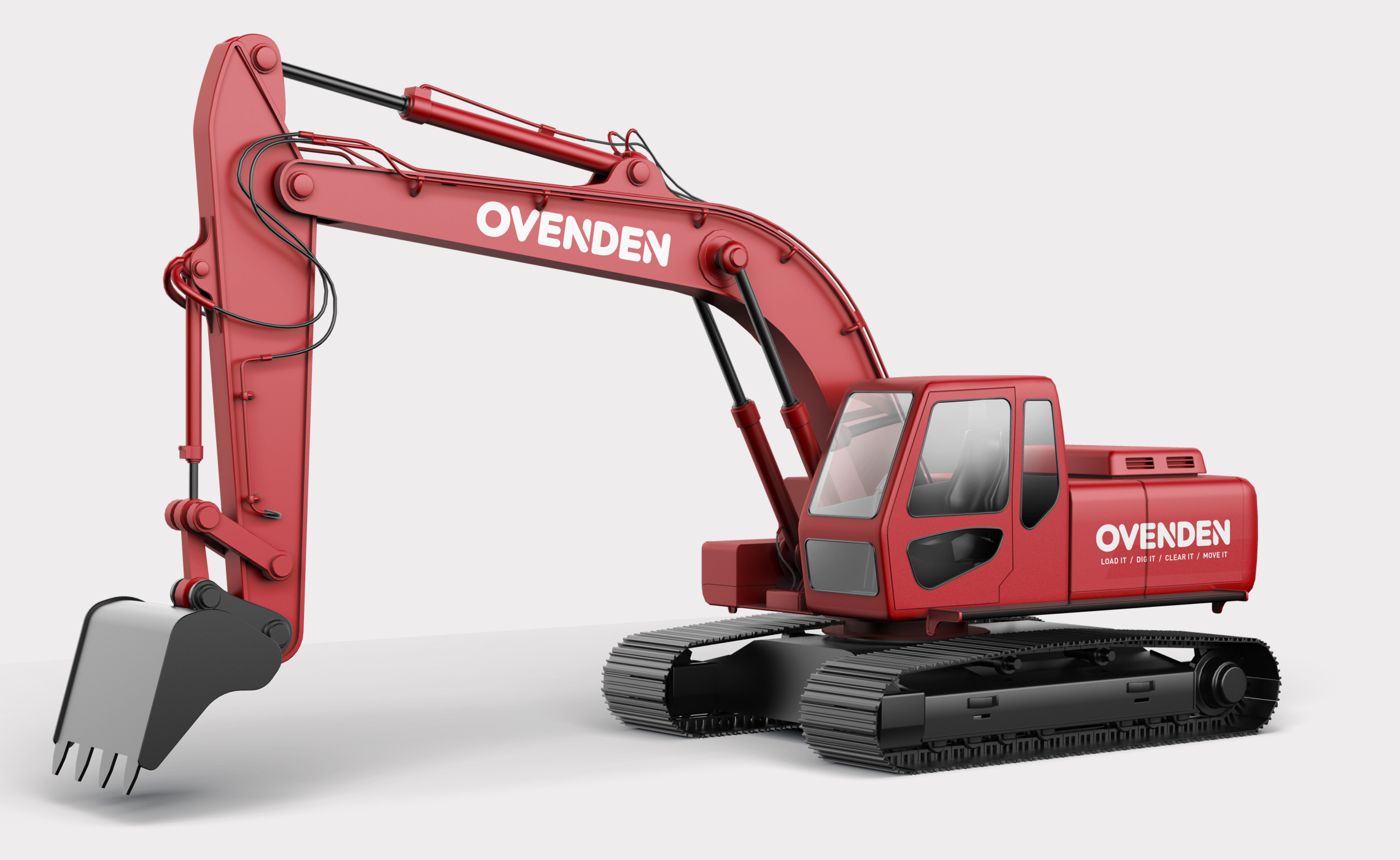
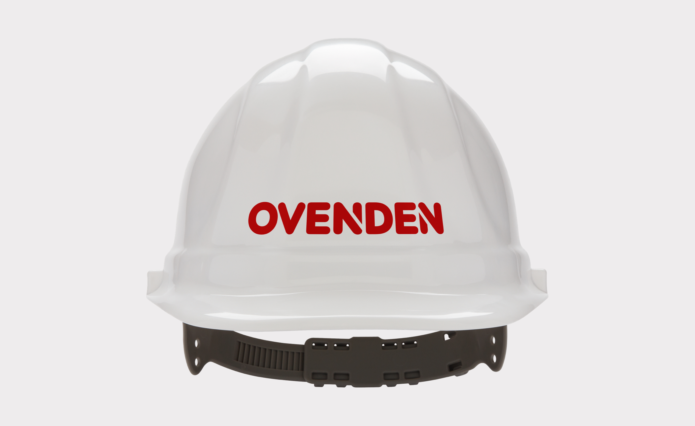
Ovenden have over 45 years experience in the haulage, plant hire and demolition industry, but with many hundreds of vehicles, skips and employee uniforms across the group to refresh, a full rebrand was always going to be a challenge!
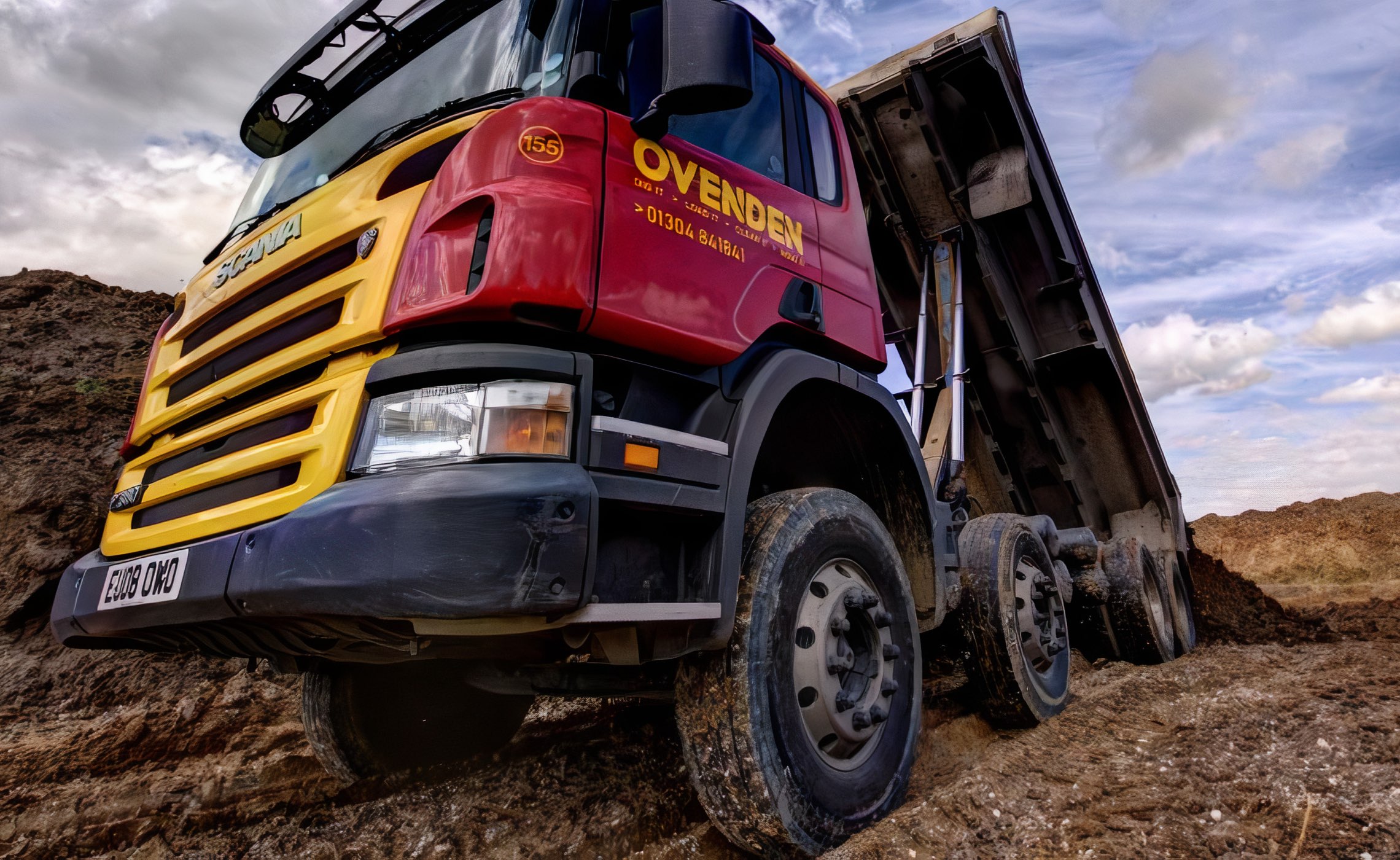
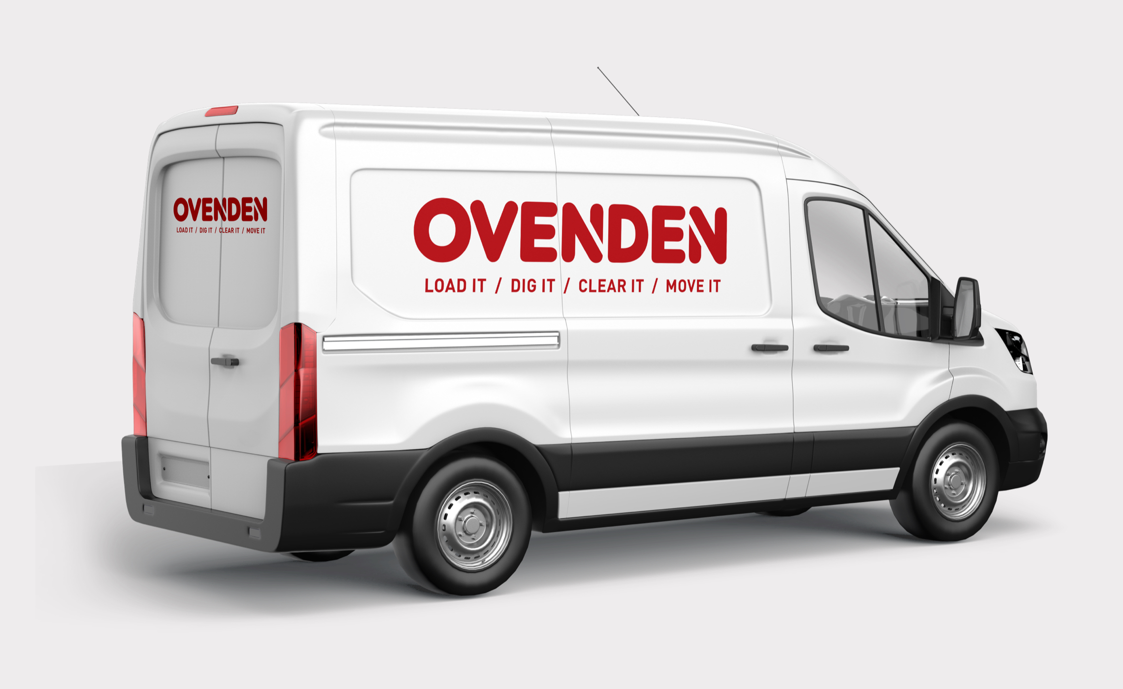
Working with agency partner Remedy we created a bold new look across the group with a strong brand identity, associated graphic language and a new strapline. We then applied this to their large fleet of heavy plant and other vehicles, signage, stationery and workwear. We also designed their new Drupal website.
The dynamic but very solid wordmark contains a ‘two-way arrow’ device that mirrors their news strapline “Load it / Dig it / Clear it / Move it” – it works well and ensures consistent recognition throughout their fleet and across the group.
Visit: ovenden.co.uk
Skills & tools
- Brand Identity Design
- Graphic Design
- Web Design
Related projects
Aspect Maintenance
Web design, advertising, livery and graphic design for UK's second largest property maintenance group, Aspect Maintenance.
Right To Health
Brand identity, application, print design and branded merchandise for this leading UK health insurance provider.


