AIA is the world-leader in the health and wellbeing insurance market. Working across multiple territories, over the years they had developed a plethora of mobile apps, all designed, named and branded very differently. They wanted these to be unified under one new ‘super app’ – that had to both work for existing customers and engage the casual ‘app-curious’ new ones.
Working with global partner Hoxby and regional research specialist Insites Consulting, we went through an in-depth naming project, with focus groups held throughout Asia. The chosen name; “AIA+” was universally liked across the region and leveraged the power of the brand whilst hinting at the extras you could expect.
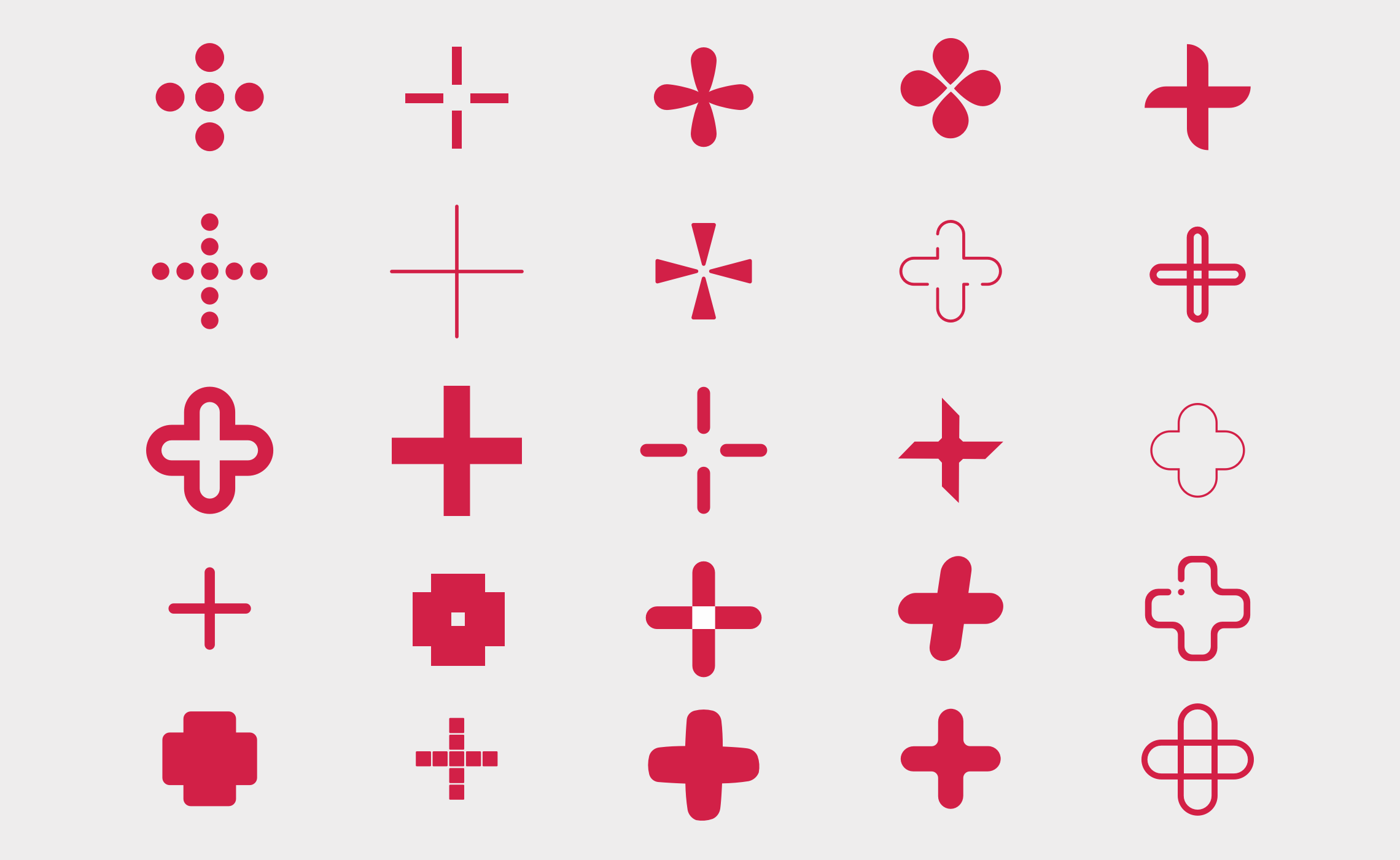
We then worked on the branding and design elements – including the crucial app icon, alongside the wider brand language, colour palettes and more. The simple addition of the “+” kept the trusted AIA brand front and centre, keeping existing customers on-board. Everything was tested with audiences in Thailand, Singapore, Malaysia, China and beyond to research cultural fit, symbolic meaning and much, much more.
The result: AIA+ was as simple as we could have hoped for – trusted, on-brand and effective.
Visit: AIA+
Skills & tools
- Brand Naming
- Quantitative & Qualitative Research
- Branding & Icon Design
AIA+ Launch Video
Related projects
Accession Capital Partners
Brand identity design, brand architecture, application and website for European fund management group Accession Capital Partners.
Tellworth Investments
Brand identity and website design for specialist equity investment management boutique, Tellworth Investments' new British Recovery and Growth Trust.


