


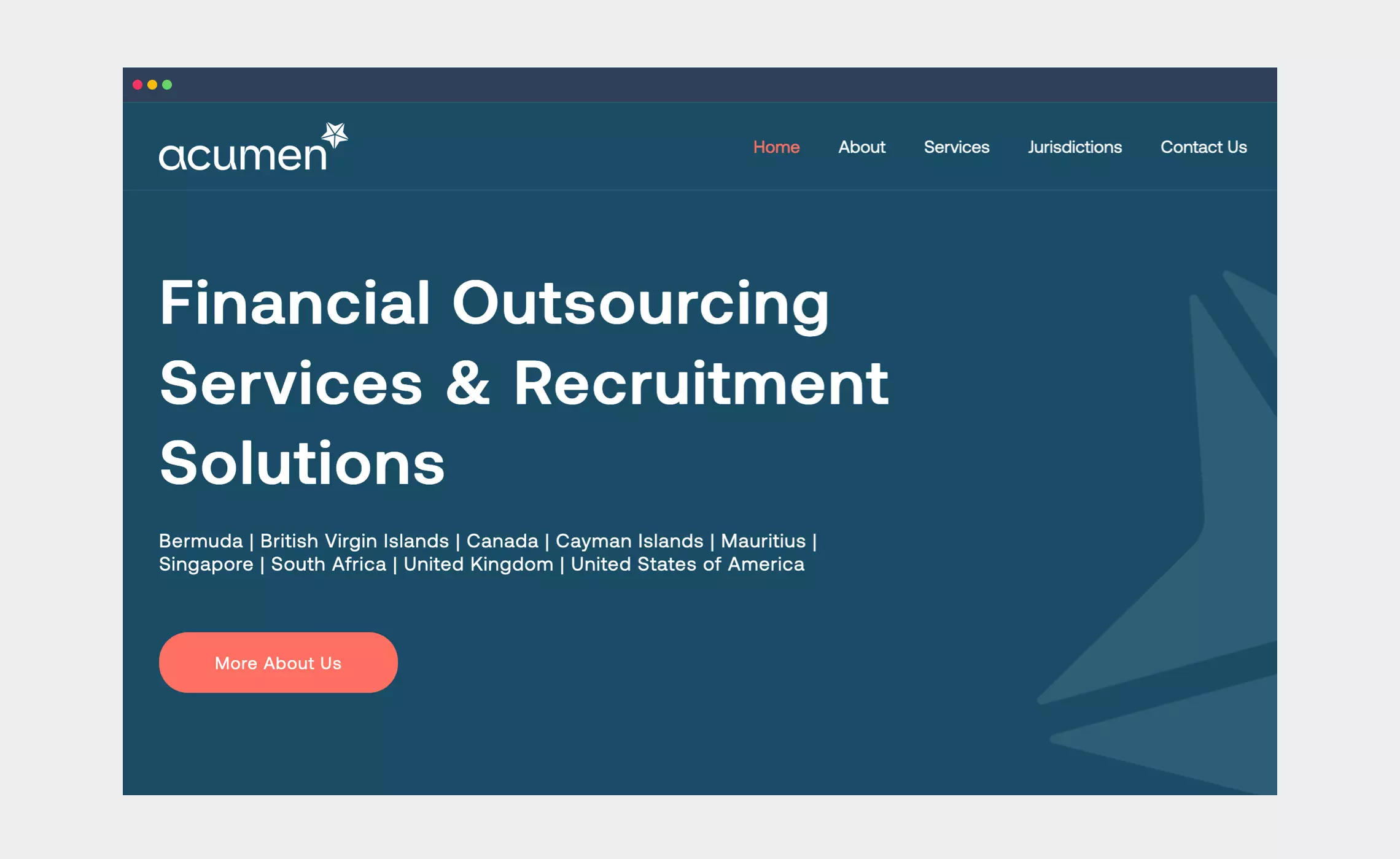


Acumen is a global specialist in financial outsourcing and recruitment services operating in Bermuda, Cayman Islands, Mauritius, Singapore and the United Kingdom. They had an identity that lacked impact and gravitas, and now wanted to ‘swim with the big players’ on the global stage.
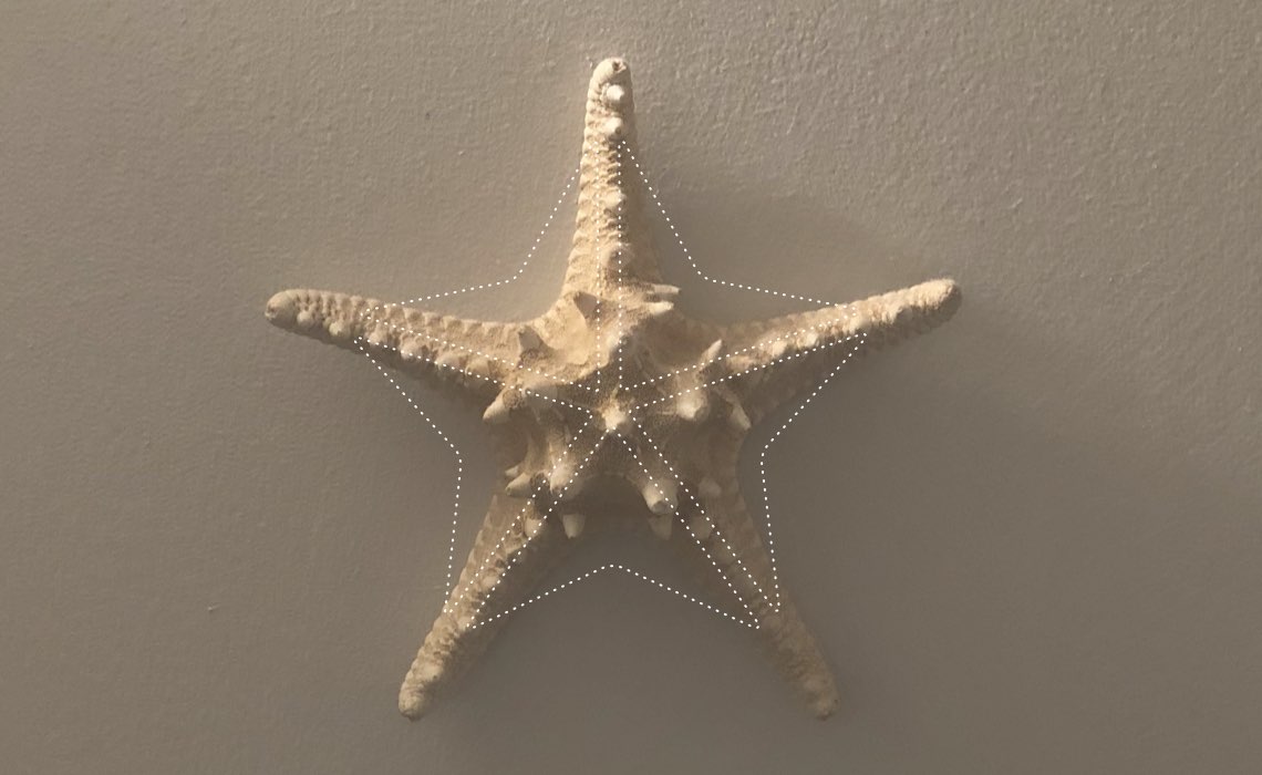
Working alongside global agency Hoxby, we took our visual inspiration from the starfish – a common sight in warmer seas. These beautiful creatures are perfectly adapted to their environment, their multiple arms giving them flexibility and strength. The simplified starfish brandmark we crafted is formed from 5 angular arrows or pointers that come together, with angles in play that echo those in the details of the quirky typeface crafted for the wordmark.
The colour palette is cool and serious but bold – a deep blue, backed up with vibrant coral and green.
Visit: acumengroup.com
Skills & tools
- Brand Identity Design
- Brand Language
- Brand Guidelines
Hand crafted
Nearly everything we create starts with pencil and paper.
The tactility and craft of a freshly sharpened Blackwing 602 making marks on a blank page allows lightening-fast iteration, and removes the barriers of time, pixel accuracy and a good Wi-Fi signal from your unconscious, creative brain.
We will often create hundreds of ideas for a branding project like this. Most of these scribbles won’t work, and that’s OK – you only need one. Refining the best of the rest, we will hone, craft and refine until we (and you) are happy.
Related projects

Accession Capital Partners
Brand identity design, brand architecture, application and website for European fund management group Accession Capital Partners.
BambuBlack
A full rebrand and brand positioning for this specialist Asia-Pacific fund and asset management boutique.