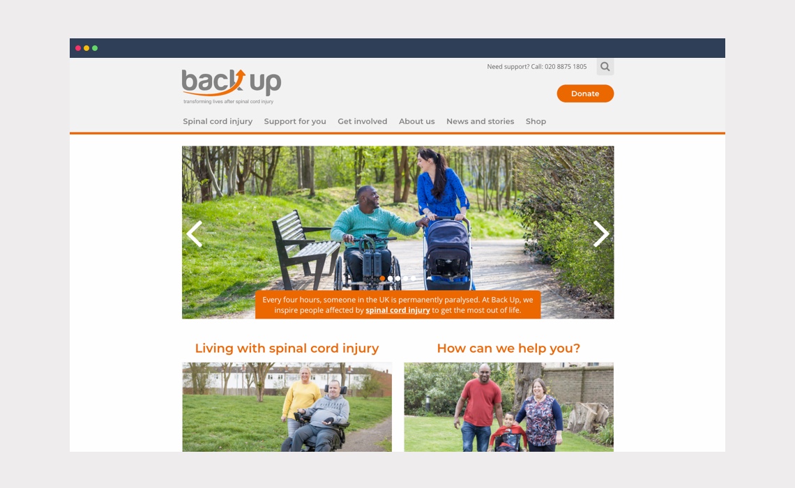
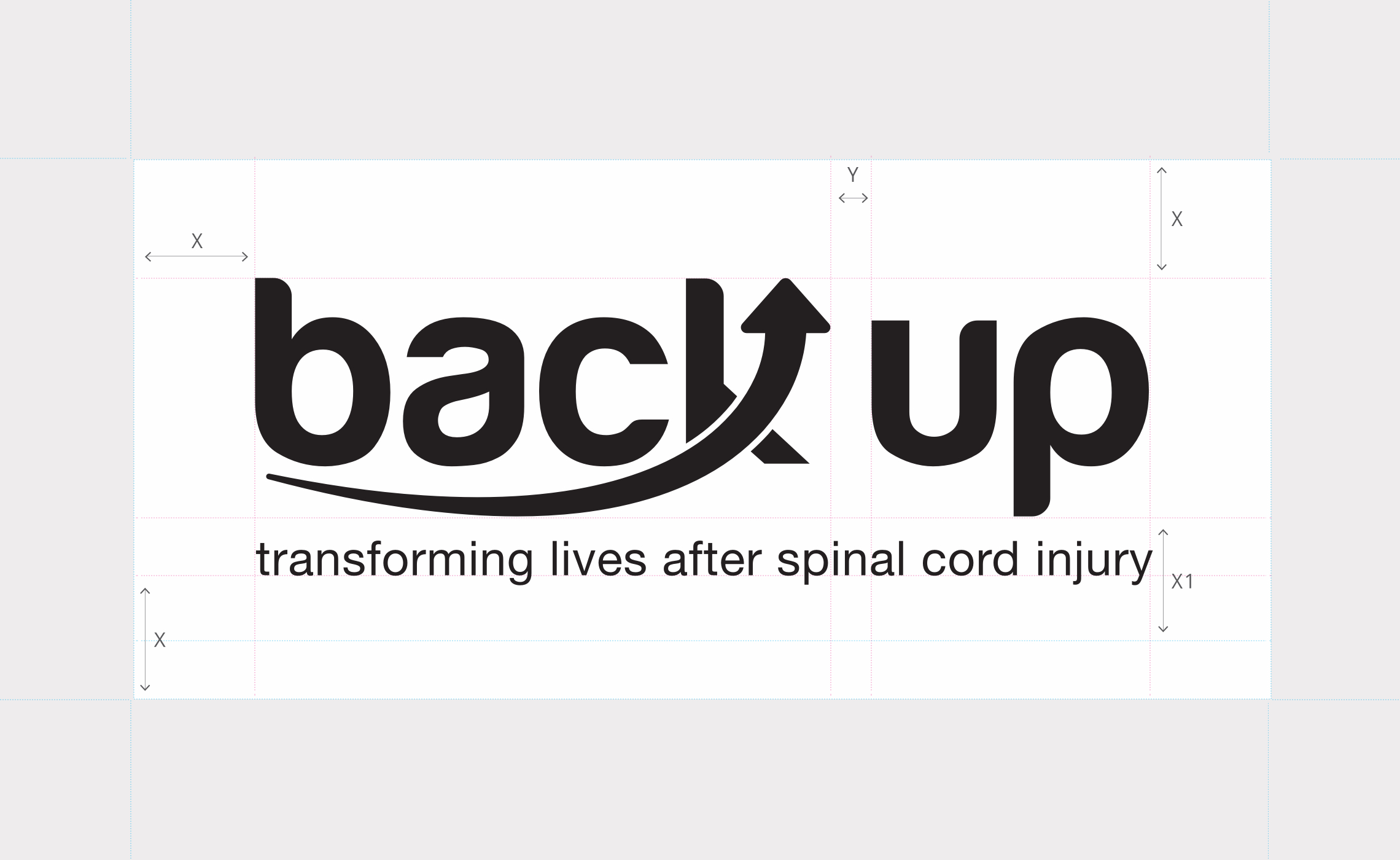
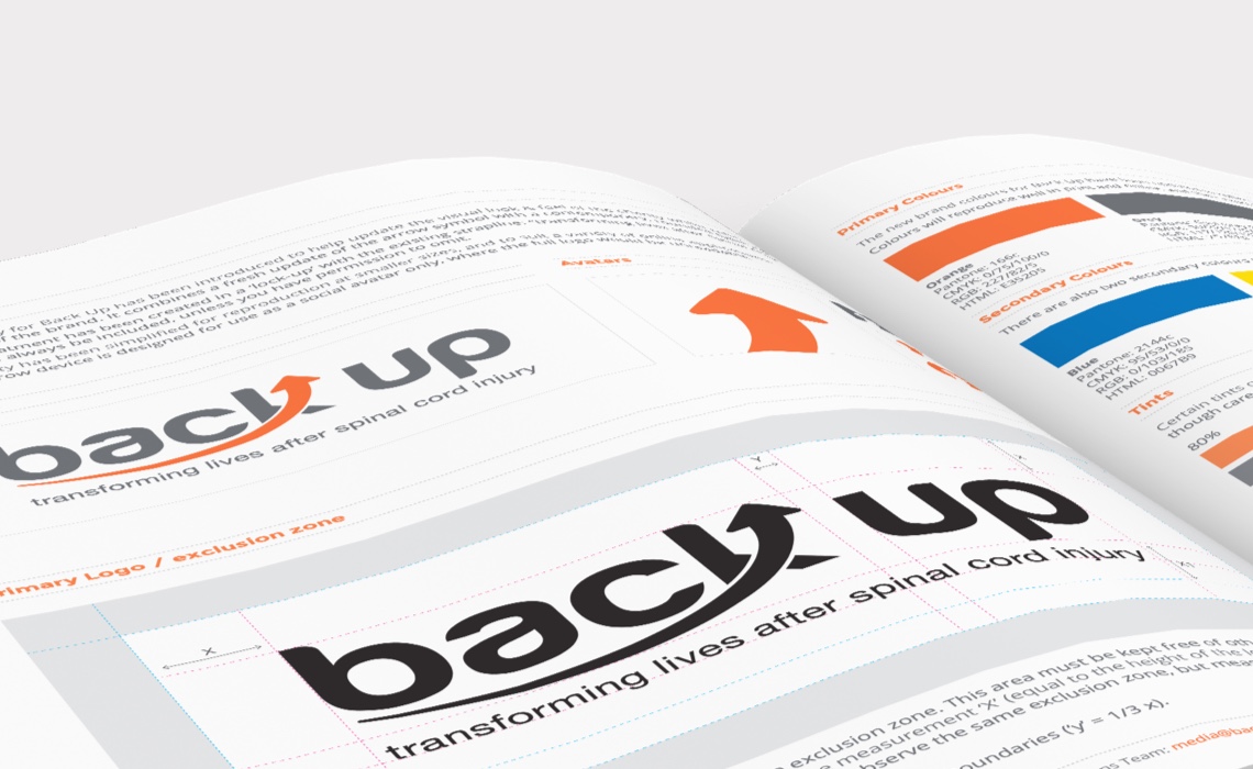
Back Up have been helping and inspiring those affected by spinal cord injury for over 30 years. We were chosen to refresh their brand identity and redesign their online presence. After the initial rebrand, we created a new accessible brand colour palette and a full brand guidelines.
Amalgamating two separate websites into a new bespoke responsive design, with massive information architecture change was a challenge, but the result has been well-worth it. The new website is fully accessible and responsive – optimised for mobile, tablet and desktop and was taken from wireframe through interactive prototypes (for testing and feedback) to final build. It is built with WordPress and has full page-level SEO and OpenGraph control built-in and is managed day-to-day solely by the client. Since launch we have streamlined all donation and online event registration including full Donorfy and StockCrowd CRM integration as well as adding an online shop, dynamic impact statistics and live support chat.
A useful information resource for the newly spinal injured has grown to become an indispensable tool for the charity, allowing them to both give and receive much more support.
Visit: backuptrust.org.uk
Skills & tools
- Rebranding
- UX Design
- Web Design
- Graphic Design
Testing Times
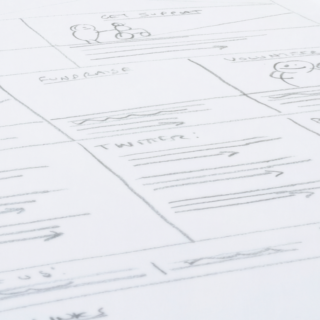
From simple pencil sketches to high fidelty mockups, wireframes are a vital part of most web design and digital projects. They allow us to agree on things like page content, hierarchy, calls to action and navigation before we get to design – saving us time and you money.
Forming part of the ‘discovery’ stage alongside content and Information Architecture planning they help ensure your new website will work for your audience before any design decisions are made. Thorough online protoyping and testing with interactive/clickable wireframes using tools like InVision lowers the risks of costly design changes made later.
Measure twice, cut once.
Related Projects
Fashion Target Breast Cancer
Website design for the 20th anniversary of the annual Fashion Targets Breast Cancer campaign for Breast Cancer Now
Queen Victoria Hospital
Brand identity design and branding system for Queen Victoria Hospital NHS Foundation Trust.
We needed an interface design that was easy for all users to navigate. The designs you provided have not changed since launch and the system’s ease of use is always the first thing that draws client commendations.


