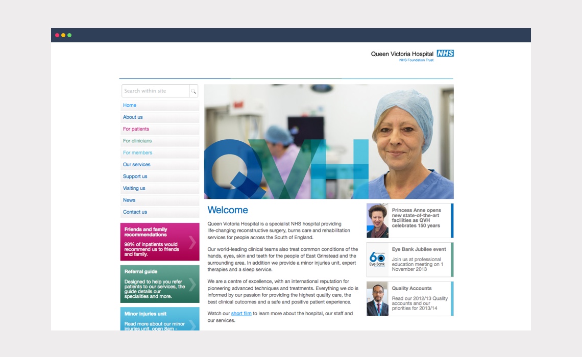
Working with health and social care specialists Raffertys we were asked to create a new brand identity for QVH, an internationally recognised UK hospital and leading specialist centre for reconstructive surgery and rehabilitation.
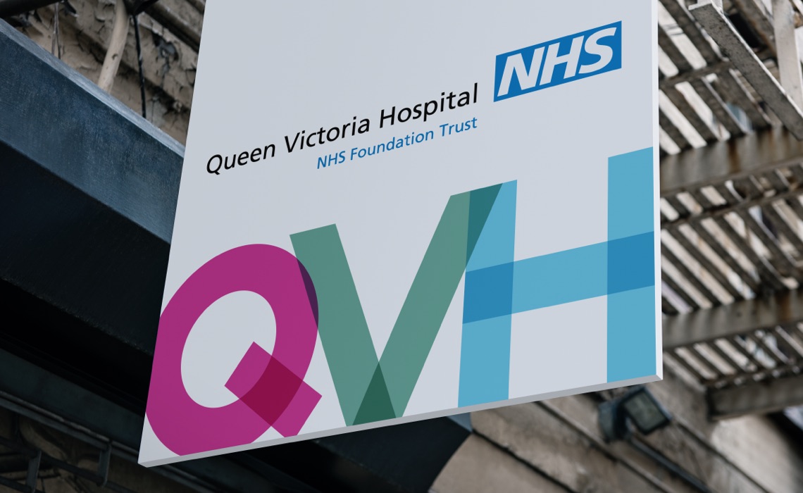
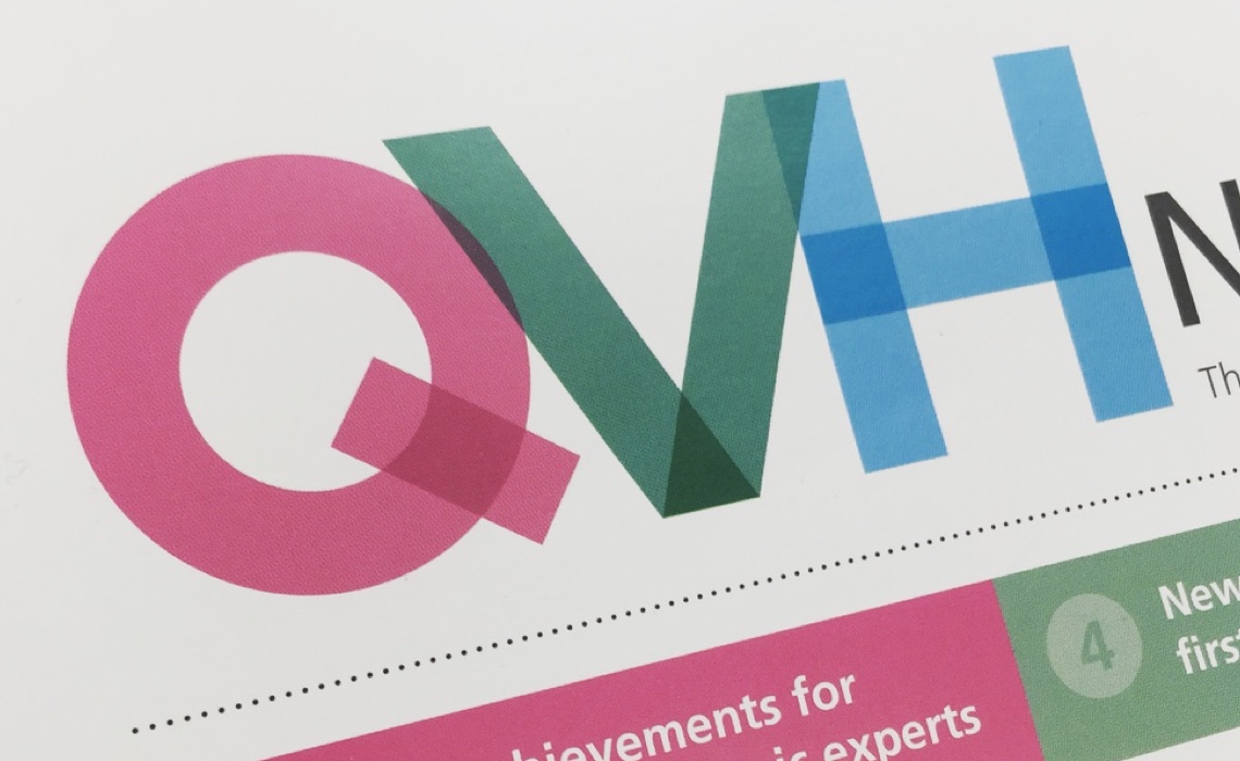
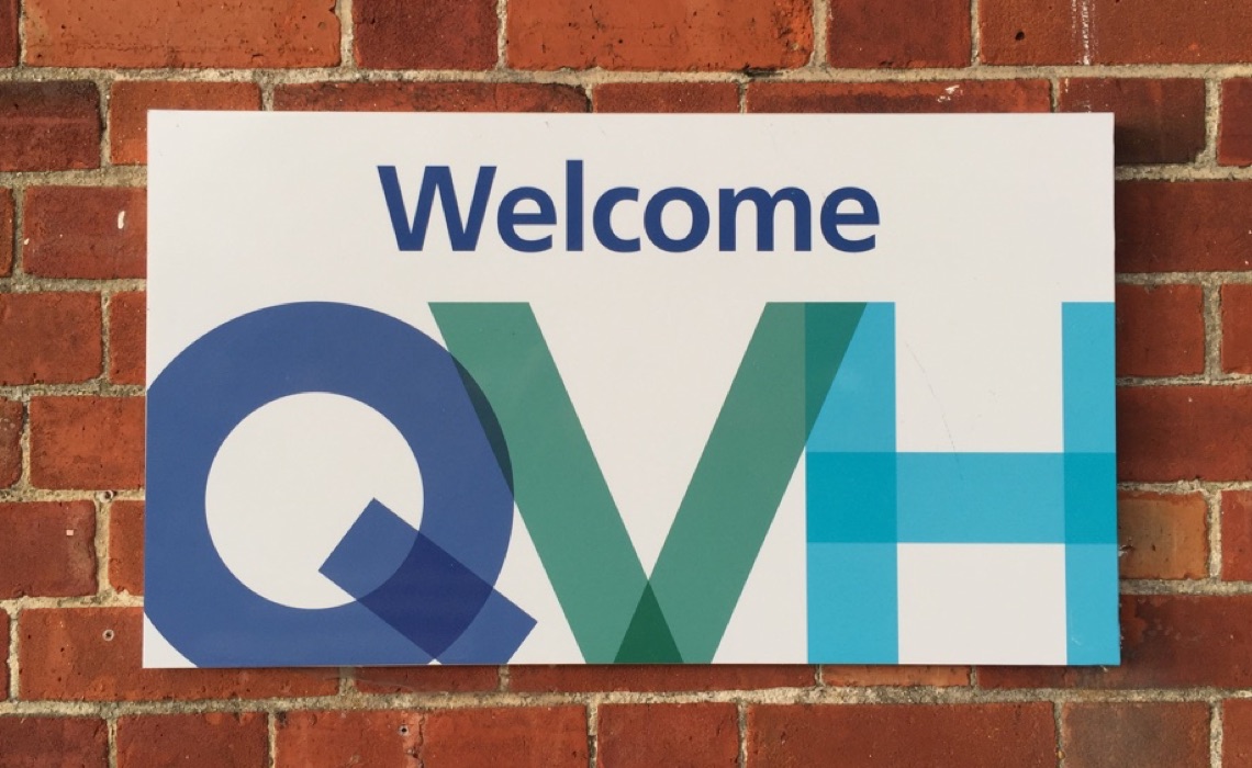
The branding was designed to work alongside the long-established NHS brand guidlines – to ensure continuity but it also had to achieve a degree of standout. It needed to be elegant and bold, distinctive and had to work well in a variety of contexts, both online and offline. The flexible overlapping brandmark and accompanying brand language we created is used across all communications and touchpoints, from external and internal signage, through print communciations and newsletters to the website.
Skills & tools
- Brand Identity Design
- Brand Language
- Graphic Design

Brand language
Alongside the main identity, we also created a secondary brand identity version and full brand language. This consisted of bold primary and secondary colour palettes, sympathetic to the core NHS brand colours, additional graphic symbols and styles and some simple rules for future application.
This graphic language continues to help reinforce the core identity and is flexible enough to work in print, digital and on film.
Related projects
Fashion Target Breast Cancer
Website design for the 20th anniversary of the annual Fashion Targets Breast Cancer campaign for Breast Cancer Now
Thank you! Our new website is beautifully designed – the perfect content platform to present our brand and projects to clients and stakeholders around the world.


